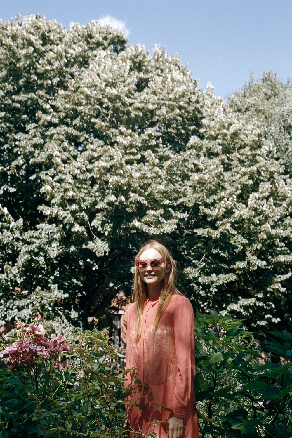
I’m quite enamoured with the peachy colour palette of this editorial – light, dusky pinks accented by deep burgundy and burnt orange shades. It’s a colour palette that would work well for those transitioning into both spring (southern hemisphere) and autumn (northern hemisphere).
Oyster Mag #100


I'm not entirely sure how Oyster manage to produce such perfect editorials every time – not that I'm complaining. Such beautiful colours, you're completely right! xx
Peach is one of my favourite colours to wear – it's one of the few colours that breaks my grey and black monotony 🙂
I fell in love with this when I saw it as well!
Not many mags do an editorial quite like Oyster.
These are gorgeous, and the colors are really perfect for transitional seasons. The shoes in the shot on the bottom right…those are more than perfect!
I love these colours too! That first photo is just dreamy.